Mobile Wellness Platform: UX Audit & Design Strategy
Independent web platform evaluation and mobile app strategy for founder-led yoga and meditation startup.
UX Designer•January - March 2025•Silla
Founder needed an independent UX audit
After 2+ years developing Siila's wellness web platform, the founder needed an independent UX audit to evaluate platform effectiveness and guide mobile expansion strategy. He sought external expertise to assess existing UX artifacts and develop strategic recommendations for mobile app development. Our team’s roal was to provide objective platform evaluation and strategic mobile design roadmap.provide objective platform evaluation and strategic mobile design roadmap.
Research Objective
Understant users & contex of use
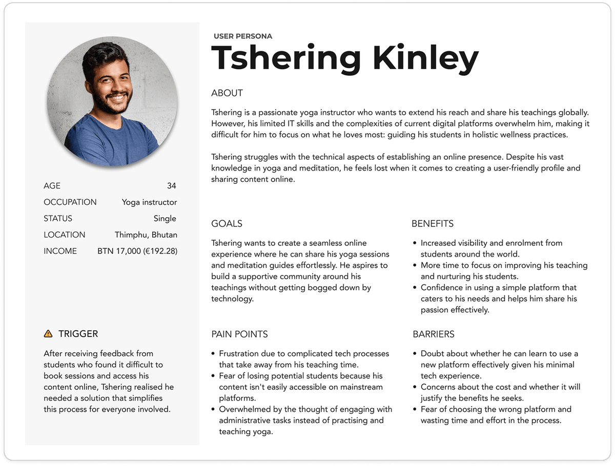
Our research targeted two distinct user segments: yoga professionals (instructors and studio owners) and yoga practitioners (individuals seeking classes). I was responsible for the professionals segment, focusing on understanding their business needs, technical challenges, and platform requirements.
Research Methodologies
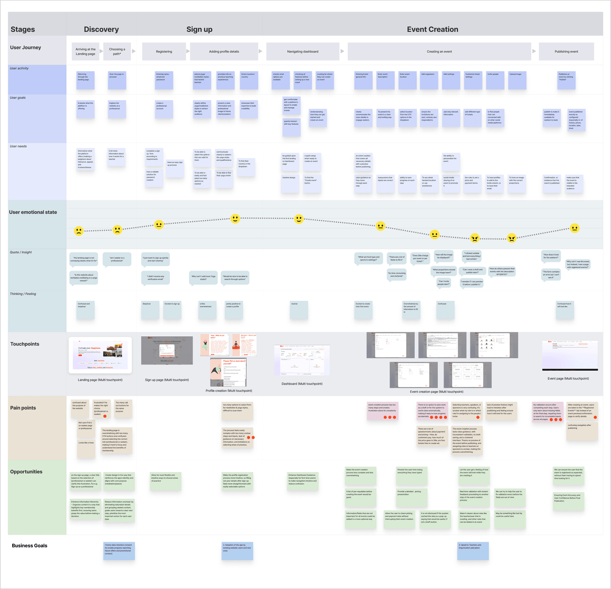
As-Is User Journey Mapping revealed critical workflow failures
We conducted comprehensive user journey mapping, role-playing exercises, and user interviews to understand current platform pain points. Desktop research and competitive analysis mapped the wellness platform landscape, revealing fragmented market offerings and opportunities for integrated solutions. Key Problems Identified Through our research with wellness professionals, we uncovered critical usability issues:
No Draft Saving Functionality
Wellness professionals lost work progress when interrupted during event creation, forcing them to restart the entire process. This created significant frustration for instructors who often multitask between teaching and administrative duties, leading to abandoned event postings and reduced platform engagement.
Lack of Real-Time Feedback
Users received no immediate validation during form completion, leaving them uncertain about input requirements and progress status. This absence of guidance created anxiety and confusion, particularly for first-time users who couldn't determine if they were completing tasks correctly or approaching deadlines.
Overly Complex Workflows
The signup and event creation processes contained excessive steps that exhausted users before completion. Instructors reported feeling overwhelmed by the number of required fields and decisions, particularly those with limited technical experience who wanted to focus on teaching rather than navigating complex interfaces.
Mobile-First Requirements Translation
Based on all insights, we defined specific mobile app requirements addressing identified workflow failures: mandatory draft saving, streamlined processes optimized for mobile interactions, and real-time form validation with immediate feedback.
We prioritized mobile-native patterns and simplified information architecture intuitive to yoga professionals regardless of technical expertise.
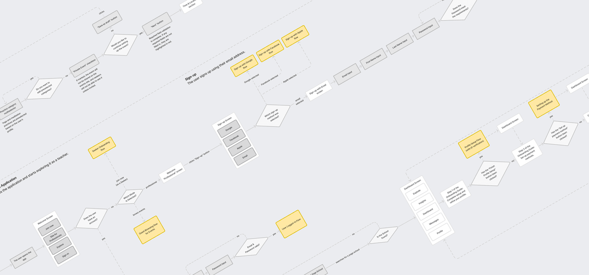
We redesigned the entire workflow into a three-phase process
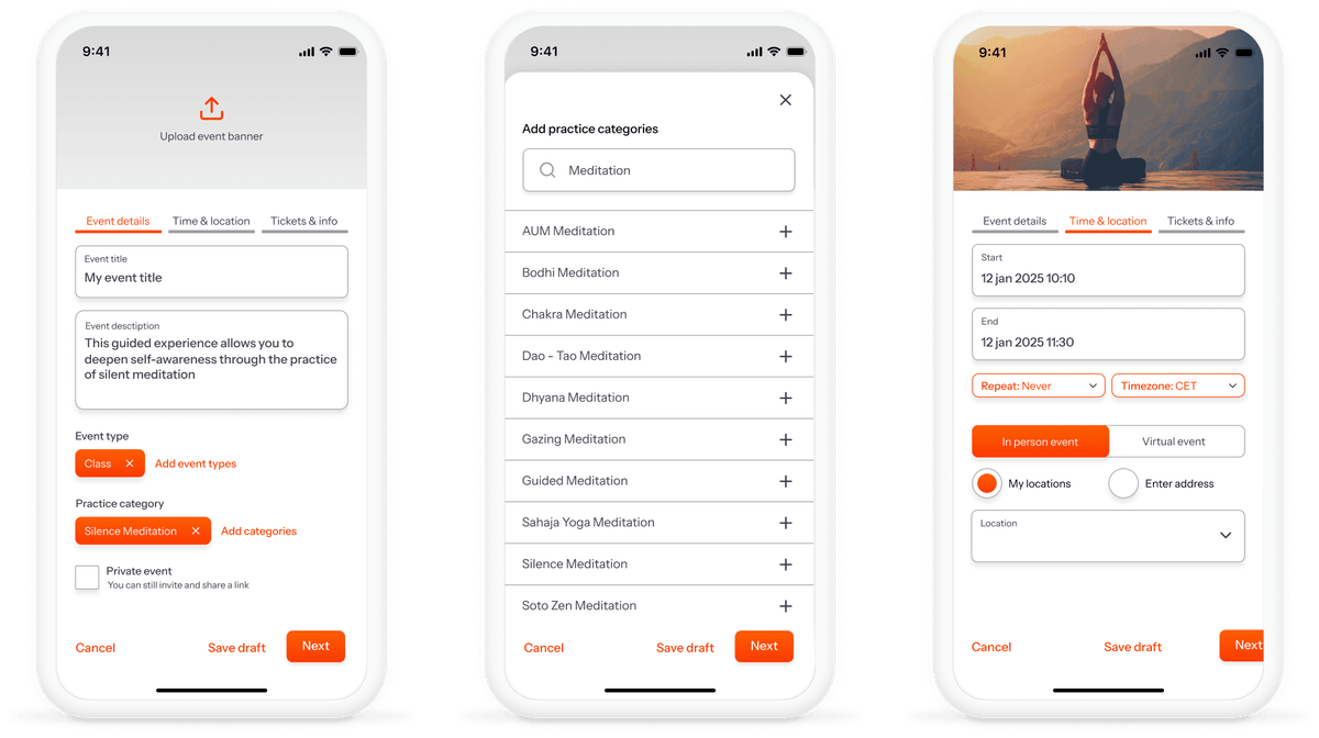
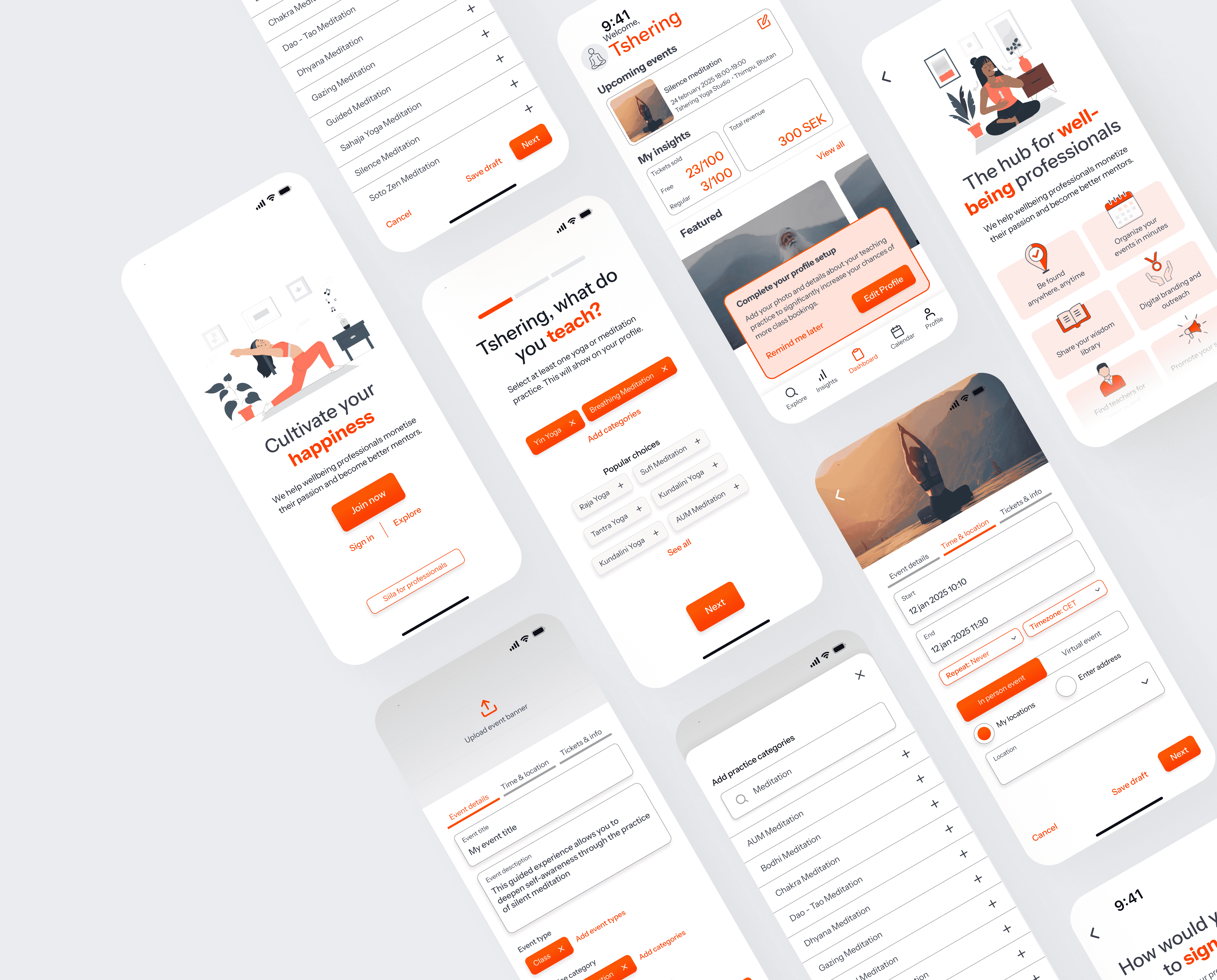
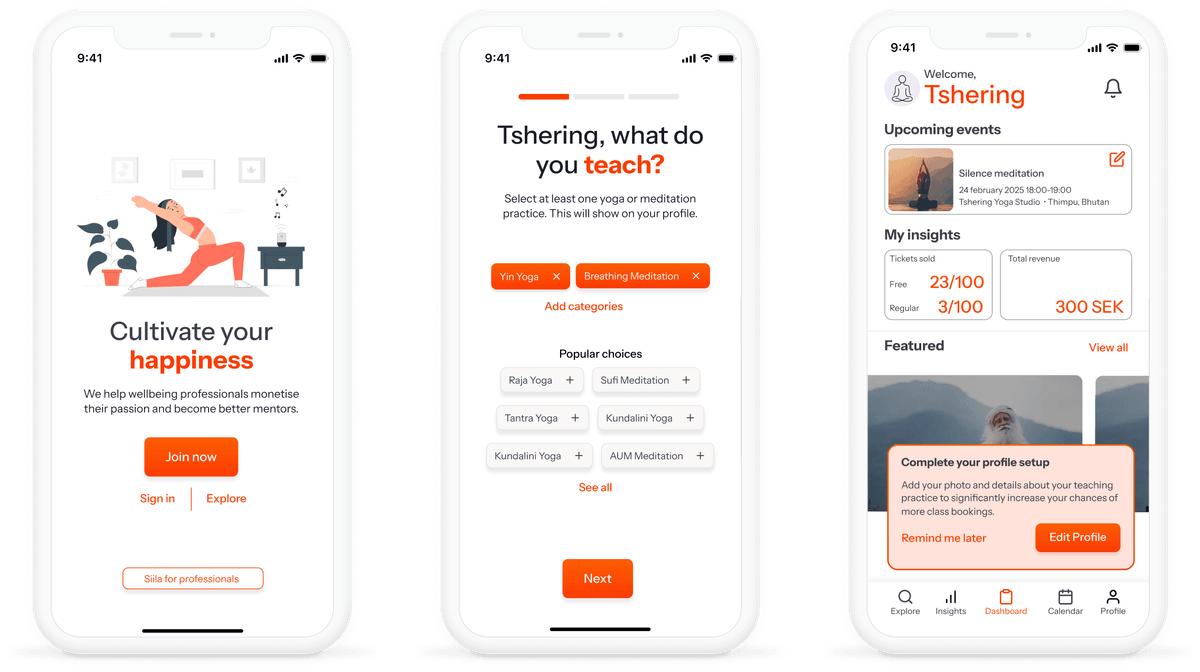
We redesigned the professional workflow into a three-phase process, reducing steps by 50%. Key solutions included real-time validation, persistent draft saving, simplified onboarding with clear user role definition, and mobile-native interaction patterns with touch-optimized inputs.
The interface emphasized progressive disclosure and visual progress indicators, allowing instructors to focus on teaching rather than administrative complexity. A preview screen enabled final review before publishing, while prominent CTAs and helpful error messaging supported users with varying technical comfort levels.
Solution Validation & Founder Collaboration
We presented design solutions to the founder through interactive prototypes and strategic recommendations for mobile app development. The validation process included demonstrating how simplified workflows addressed each identified pain point and reviewing implementation feasibility within existing platform architecture.
We delivered comprehensive mobile app strategy documentation, including User Journey Mapping, To-Be Storyboard, User Flows Design System, Hi-fidelity prototypes that positioned Siila for successful mobile expansion while maintaining platform integrity.
